
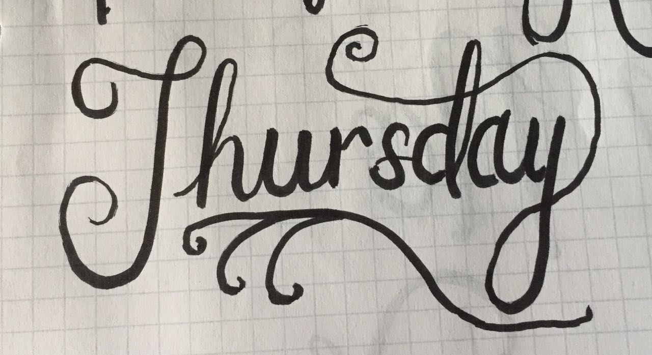
The one script word I did this week that I feel turned out really beautiful. Far from perfect, but it was the only word I did where I thought it looked like it belonged in the “script hand lettering” category!
Three months into the new year, I am actually still working on my New Year’s resolution goals. This is a rarity for me and my attention span, but I’m excited that I have stuck with my goal of “learning” this year. I’m focusing on web design and hand lettering, and both are going pretty well. The web is further along than the lettering, but I’ve always been more computer savvy than drawing savvy.
One of my favorite aspects of hand lettering are the beautiful brush scripts. The long flourishes and swirls that can come off of a letter are stunning. You can create script with a pencil and marker and coloring in the letters, but I really like the brush pens that allow you to write based on your hand pressure. This week, I purchased two Tombow brush markers from my art store, and I enrolled in the Hand Lettering Basics class through Skillshare.com.
True art paper that is thick and that can handle markers, lots of erasing, etc is pretty expensive stuff. Since I’m such a newbie and spend most of my time erasing, I went to Office Max and bought cheap $1 notebooks. I got a basic graph paper notebook that a math student would use and a penmanship notebook for elementary age children to learn to write basic letters. The paper is very thin, and I have to put a sheet under it so the markers don’t bleed through, but the penmanship notebook already has the ascender, baseline and descender lines built in—perfect for learning script letterforms.
The Skillshare class has helped a lot, but what it ultimately takes is practice both with the letterform itself and the amount of pressure to put on the pen. The Tombow is very, very sensitive, and it only takes a gentle touch to make it start writing. It’s been a fun process, and I’m glad to see improvements.
Overall, I know I’ve improved a lot on this journey, but at the same time, I get frustrated that I’m not further along. It seems so hard, and I still look like a little kid doodling. But, most of the lettering artists I admire have practice for years or even decades to perfect their craft.
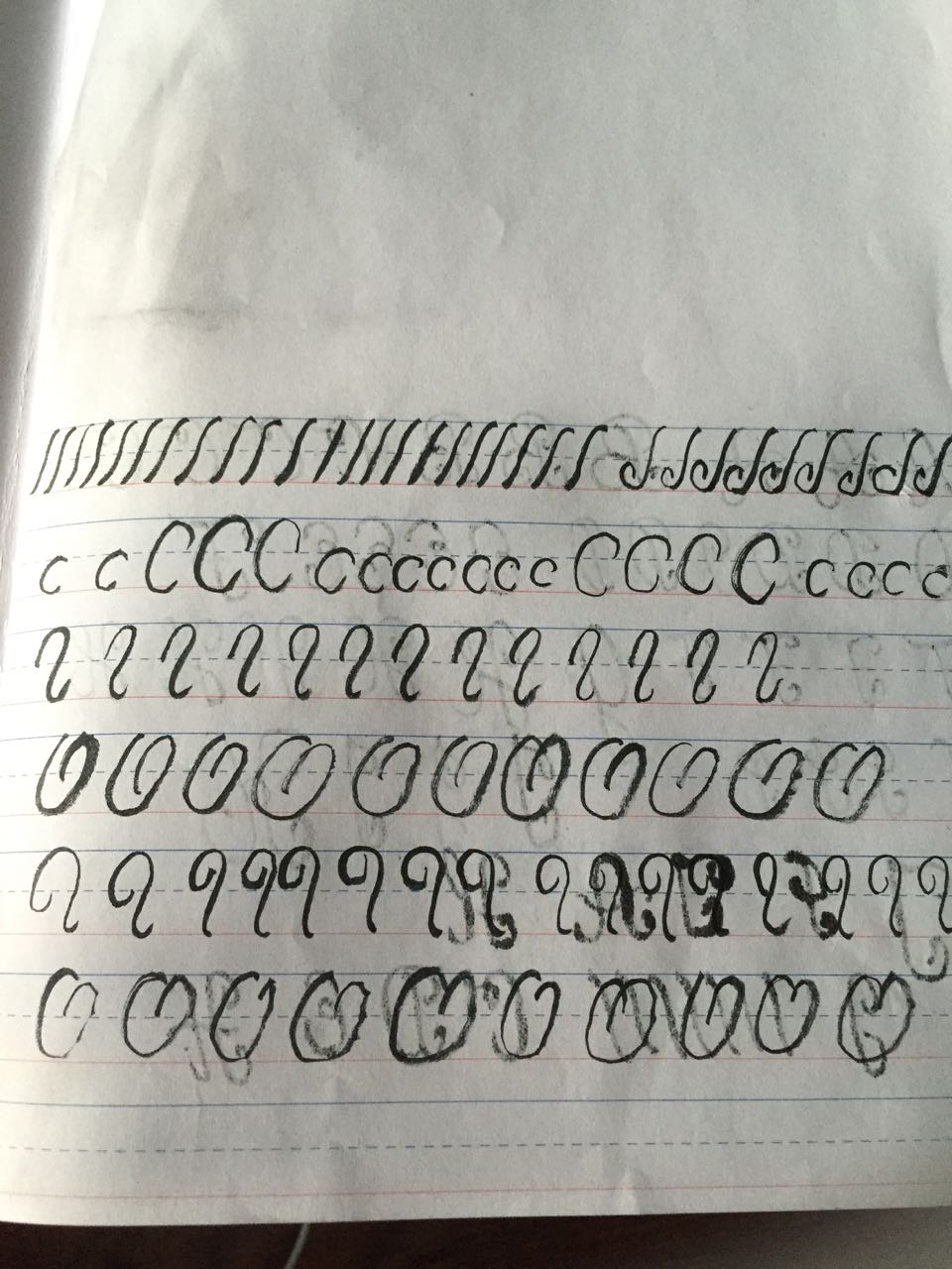
In the Skillshare class, you spend the first section just practicing strokes to get yourself familiar with the shapes and pressure amounts. Mine are pretty rough here.
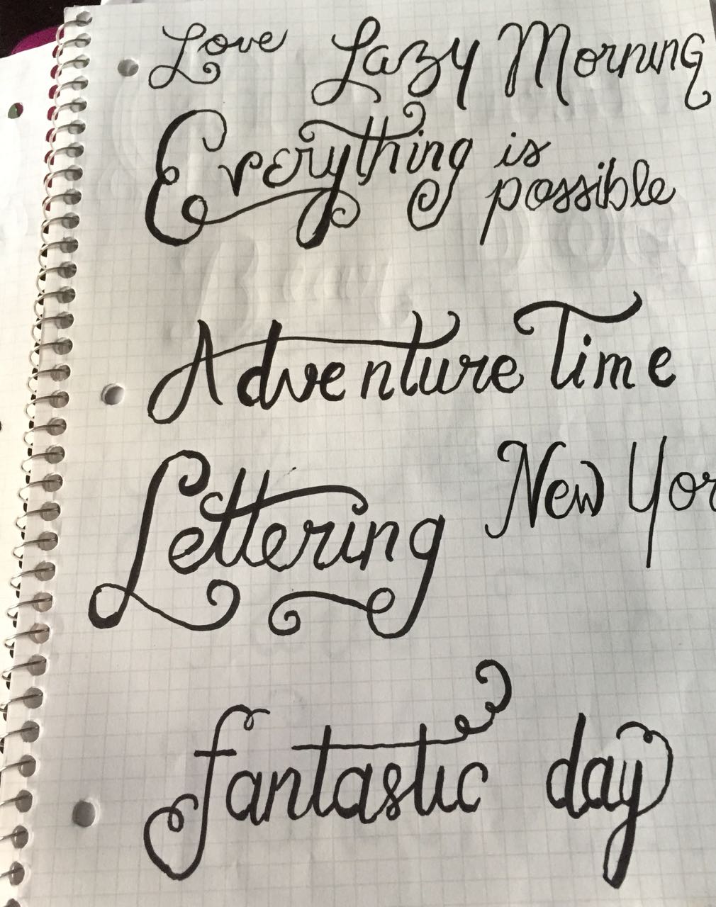
I looked up script lettering in Google and just tried to copy the letterforms I saw. Not too bad…well yeah, but everyone has to start somewhere.
Freehanding script based on what I ahd learned. I don’t like that mine still looks like grade school cursive handwriting. I definitely want more of a script font / calligraphy feel.
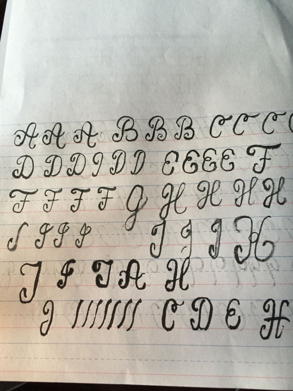
You start learning the capital letterforms first. They’re my favorite, because they have the most potential to add flourishes, swooshes and swirls to make them very ornate.
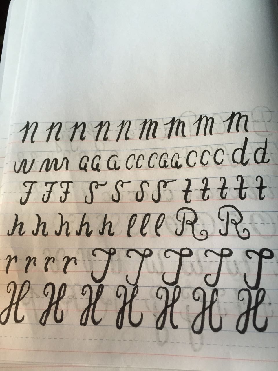
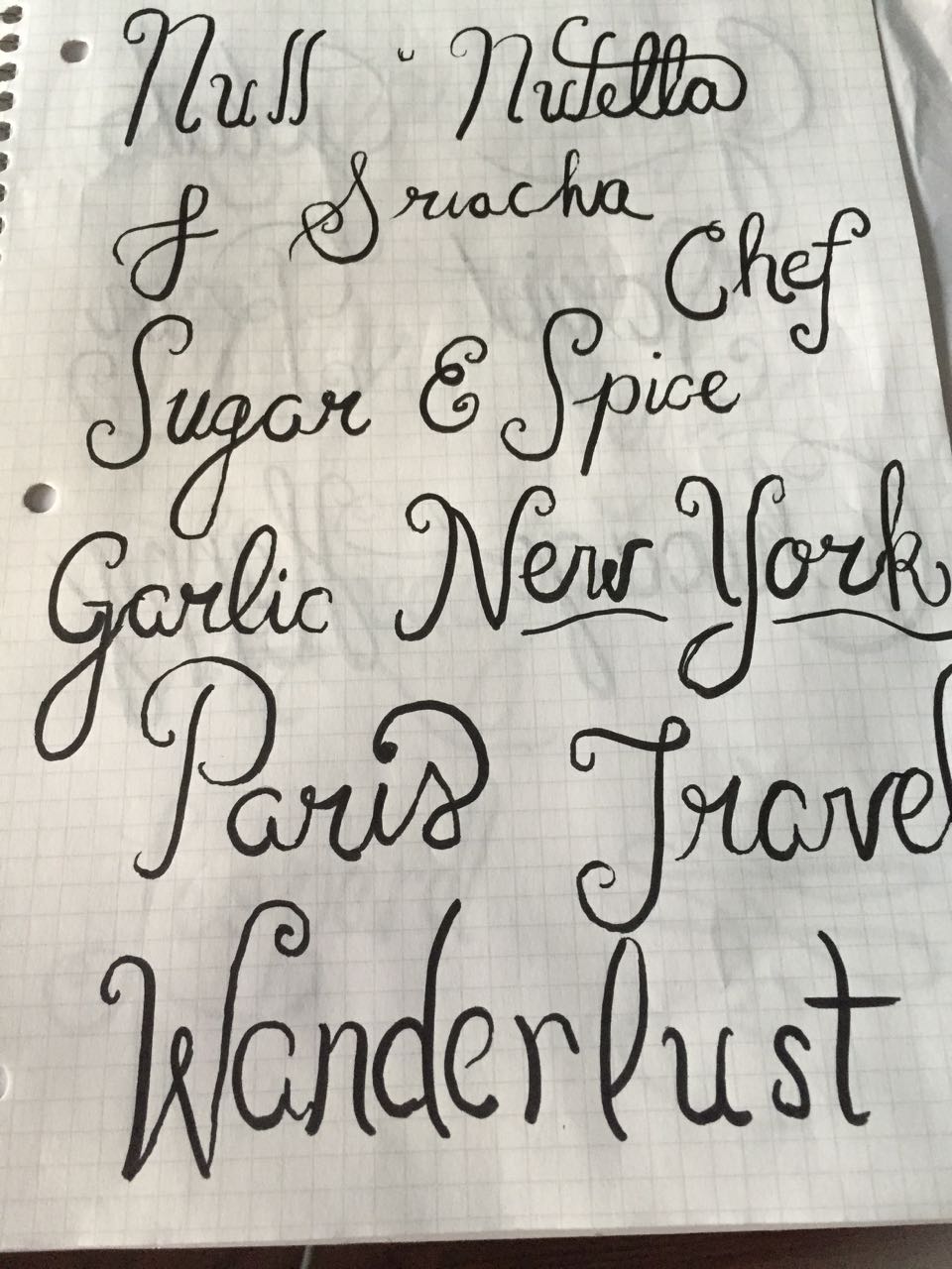
When I practiced my letterforms the next day, I really showed some improvement. For me, the “n” and “m” in lowercase form are some of the hardest to create.

