On Hiatus Until July 1

Readers,

I will be on hiatus until July 1. My schedule lately with my full time job and freelance have been off the charts busy. I’m thankful to have a lot of freelance coming in, but it’s challenging to get it completed when I’m working extra hours at my regular job as well.

I plan to be back July 1 and post regularly again. I thank you for reading and for your patience.

Regards,

Noel

Small Bites: Design Links I Love | National Stationery Show Edition | May 18, 2015

Happy Monday! Like many graphic designers, I am obsessed with paper. I hoard notebooks, buy cards that I’ll never send strictly for the design, agonize for hours over finding the perfect pen to write my grocery list. It’s a designer thing. But, it’s a big designer thing, because stationery is still a whole industry, despite this digital age we’re in. Yesterday, began the National Stationery Show in the Big Apple. My Instagram has been blowing up with some amazing photos of stunning cards, lettering, calligraphy and beautiful paper. I thought I would make this week’s Small Bites a National Stationery Show edition and link to some of the awesome shops and letterpresses out there.

Emily McDowell Studio: She recently made the news for her beautiful empathy cards. When Emily had cancer, she had a lot of friends disappear because they just didn’t know what to say or how to handle her illness. She felt lonely and afraid at a time when she most needed support. So, she designed these empathy cards that really say how much being ill is awful, but with a bit of humor. Read the NPR story here.

Rifle Paper Co: This amazing company hails from Florida and makes beautiful stationery, cards, notepads, iPhone cases and prints. To me, their style looks like what would happen if Kate Spade and Wes Anderson got married, and it’s beautiful.

Hen Pen Paper Co: From Ohio and comprised of a husband and wife team, Hen Pen makes delightful cards and stationery with adorable illustrations and whimsical lettering.

Ladyfingers Letterpress: Definitely my favorite for a few reasons—they’re headquartered here in Colorado Springs, which is awesome. And, they are seriously killer designers and letterpress printers. Their cards are stunning and they recently earned a spot in the printmaking issue of Uppercase Magazine. And, as of last night, they won 6 Louie Awards for their work at the show.

Follow the National Stationery Show this week on Twitter and Instagram with the handle @stationeryshow. The hashtags are #NSS and #NSS15.

Year of Learning: A Hand Lettering Milestone

Four months into the year, I’ve stuck with my New Year’s resolution of learning hand lettering, and I’ve completed my first full sketchbook with practice projects. Roughly 150 pages, I practiced nearly every day since I started and have actually gotten better. Furthermore, on my journey, I’ve discovered script calligraphy, which I’m actually not half-bad at. I find myself making time to draw every day, whether it’s lettering or doodling. I make sure I take time away from my screen now. The results aren’t quite at the level I want them to be yet, but I’m so proud of the development of this creative process.

I’ve always been completely dependent on the computer and lacked all confidence when it came to manual art. This exploration of a new activity has helped me become more confident and actually loving creating non-digital artwork. I’ve also noticed that drawing really helps to calm me down when I lead a fast-paced, somewhat anxious life.

I have miles to go before I sleep if I want to really try to master this craft, but maybe I won’t get to that point. It could just be an enjoyable hobby, something I need. I tend to pursue things that I want to incorporate into my business skill set, and it’s really important to have things that I simply just like to do. We’re way too busy in this modern day and age, and it’s important to take time to be. On to the next sketchbook…

My first sketchbook is complete, this was a freebie I got at the HOW Design Conference from a paper vendor's booth.

My first sketchbook is complete, this was a freebie I got at the HOW Design Conference from a paper vendor’s booth.

IMG_3045 IMG_3044 IMG_3043 IMG_3042 IMG_3041 IMG_3040 IMG_3039 IMG_3038 IMG_3037 IMG_3036 IMG_3035 IMG_3034 IMG_3033 IMG_3032 IMG_3031

My first entry in my sketchbook using faux calligraphy, things really evolve over time.

My first entry in my sketchbook using faux calligraphy, things really evolve over time.

The Hand Lettering Journey | January 7

Two new hand lettering books I bought on Amazon.

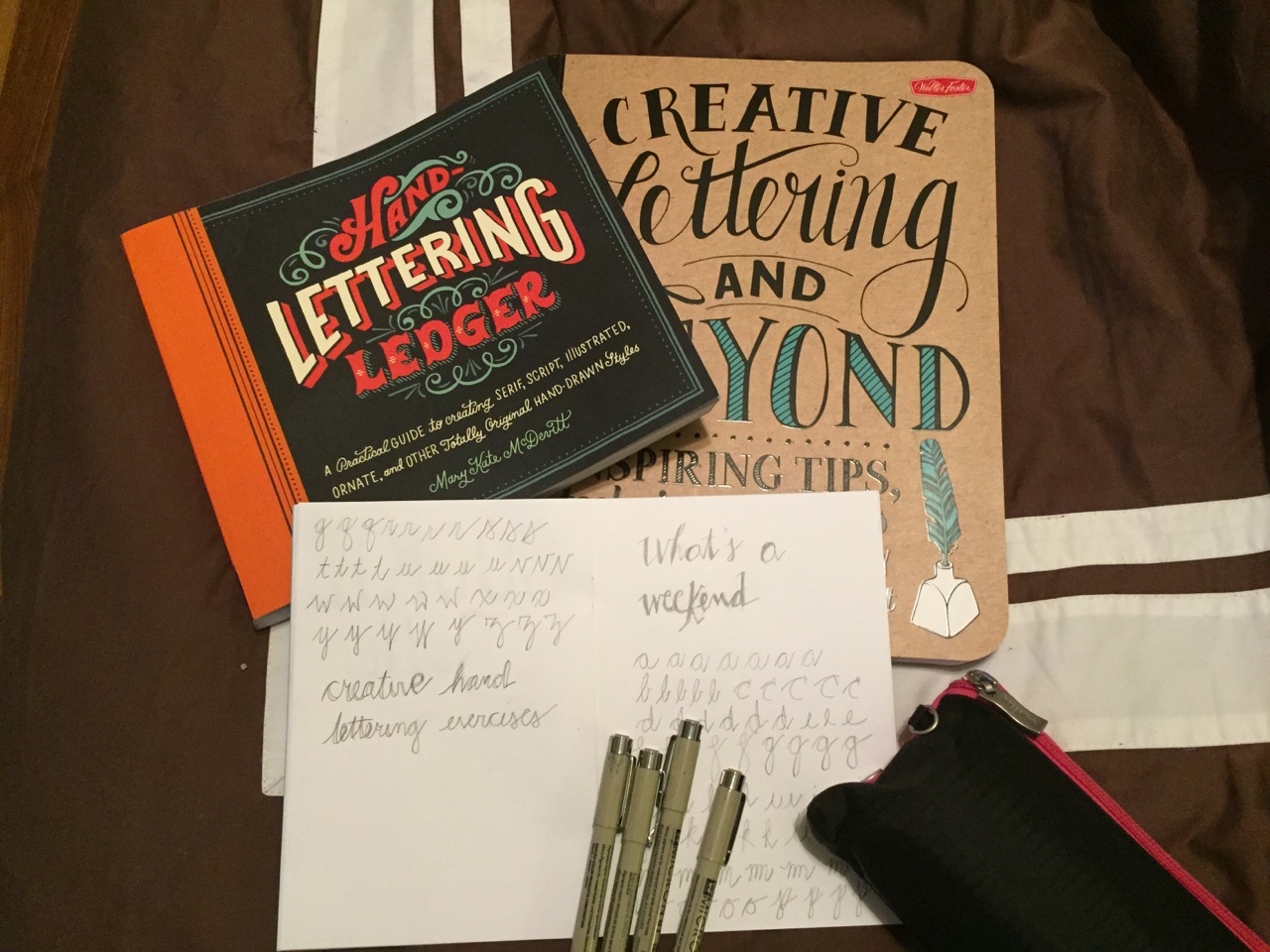
Creating Lettering and Beyond and The Hand Lettering Ledger are two books I purchased on Amazon to get started on learning this fabulous art form.

So, hand lettering has been a trend for a while now, and I’ve been an admirer for several years. I finally decided this year to stop admiring something I love so deeply and try my hand (no pun intended) at it. I’m obsessed with typography and spend more time learning about that than any other aspect of graphic design. And, although I’m not an artist, I think I could do well with lettering.

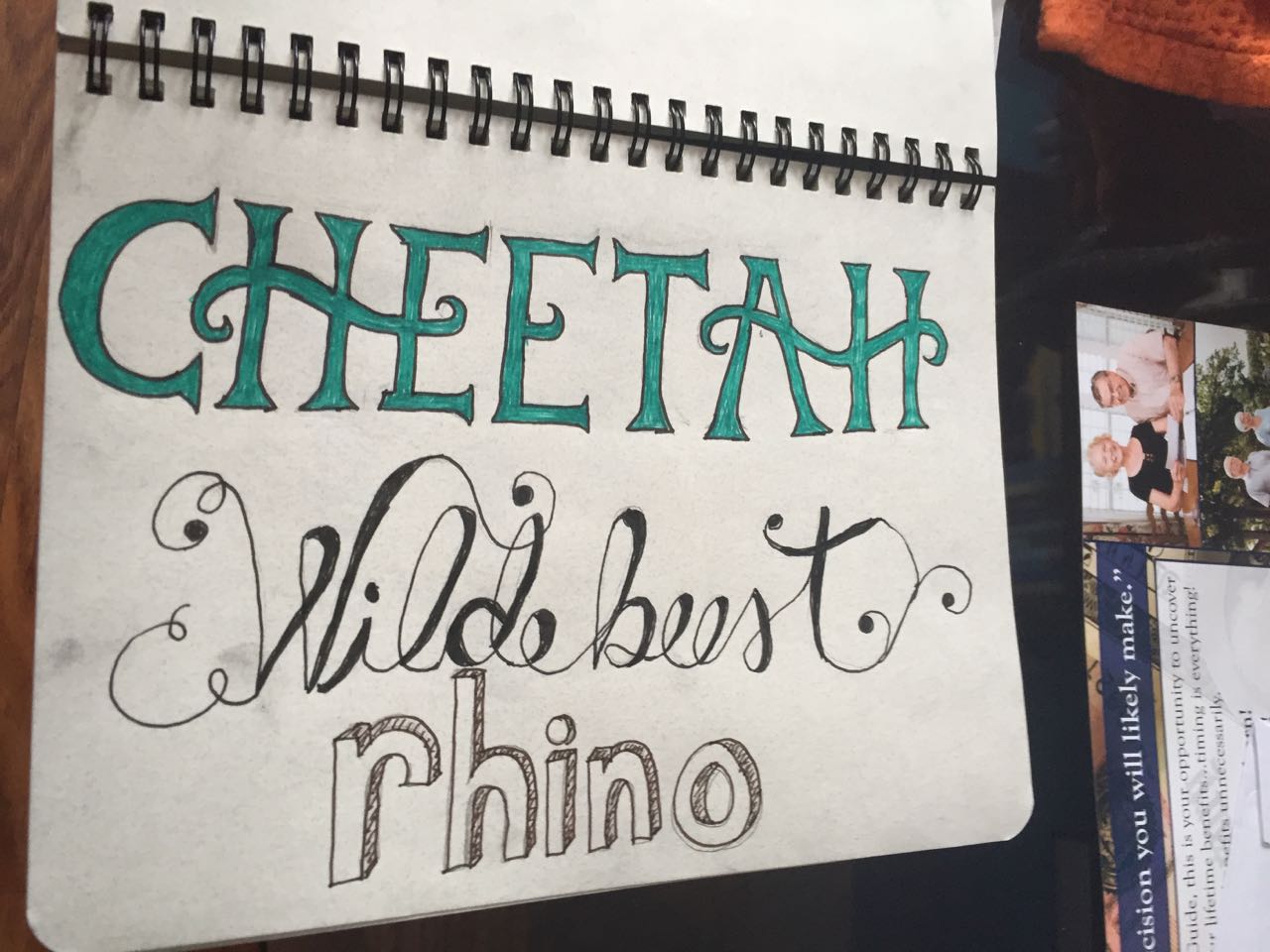
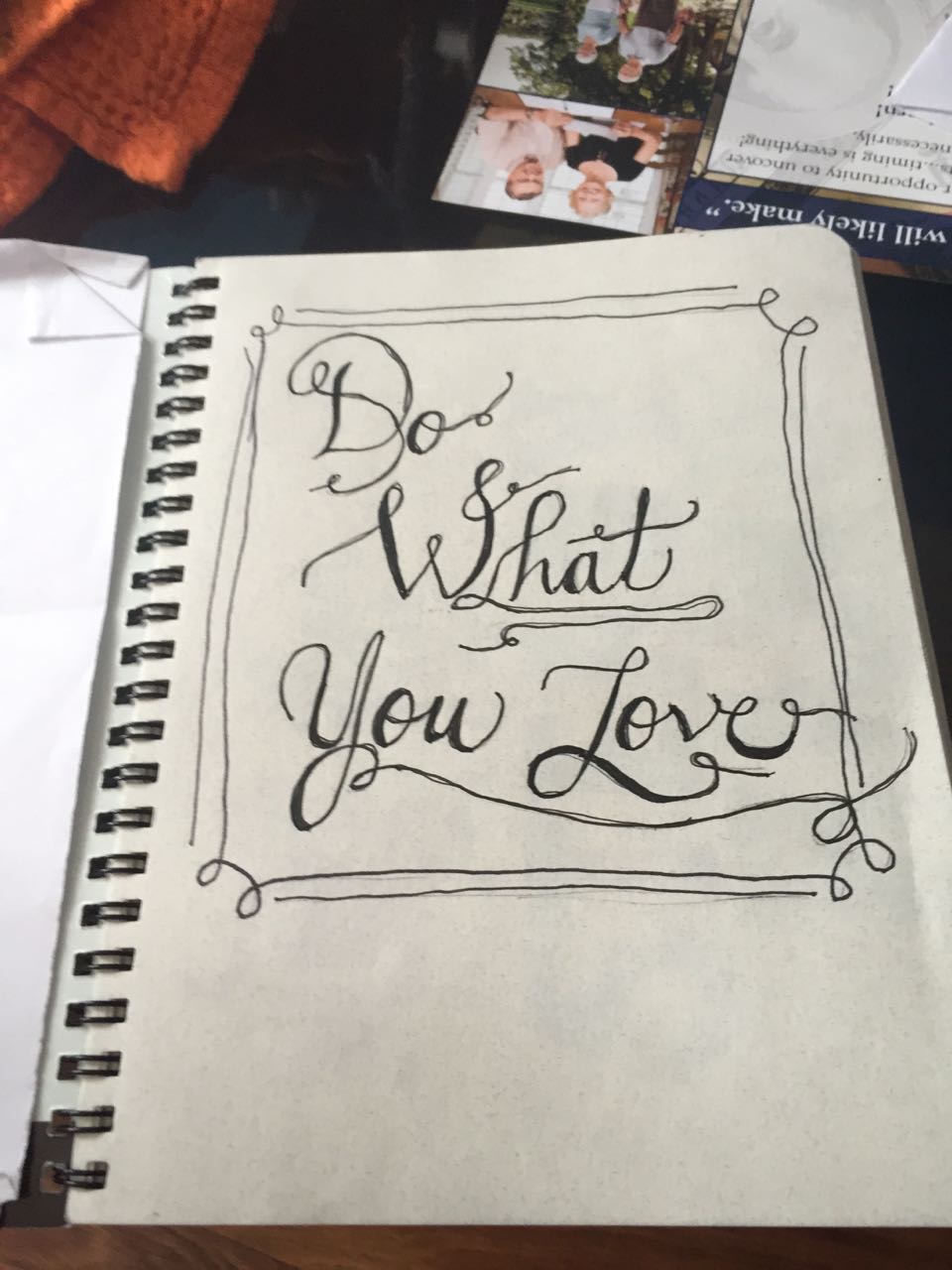
One of the perks of lettering is that it can be imperfect. Granted there are perfect letterers out there like Sean McCabe and Jessica Hische, but overall, it’s a bit homespun so you can get away with slight imperfections. I take this as my get out jail free card to have some wobbly lines in the start. Besides, once you vectorize it on the computer, you can make it perfect, right?

I’m starting with two books I bought on Amazon, “The Hand Lettering Ledger” by Mary Kate McDevitt and “Creative Lettering and Beyond” by Gabri Kirkendall, Laura Lavender, Julie Manwaring and Shawna Lynn Panczyszyn. Both seem really good so far in that they include lessons and practice pages within the books. However, the Hand Lettering Ledger seems like the best place to start to learn the different styles and letterforms whereas Creative Lettering would be a good continuation book. It includes a lot of fun craft projects where you can implement your newly acquired skills as well.

Trying out the "Serif" title and my spin on the "Surf's Up" drawing. On the latter, I was just trying to copy the letterform shapes and not mess with trying to get the perspective right like she had it.

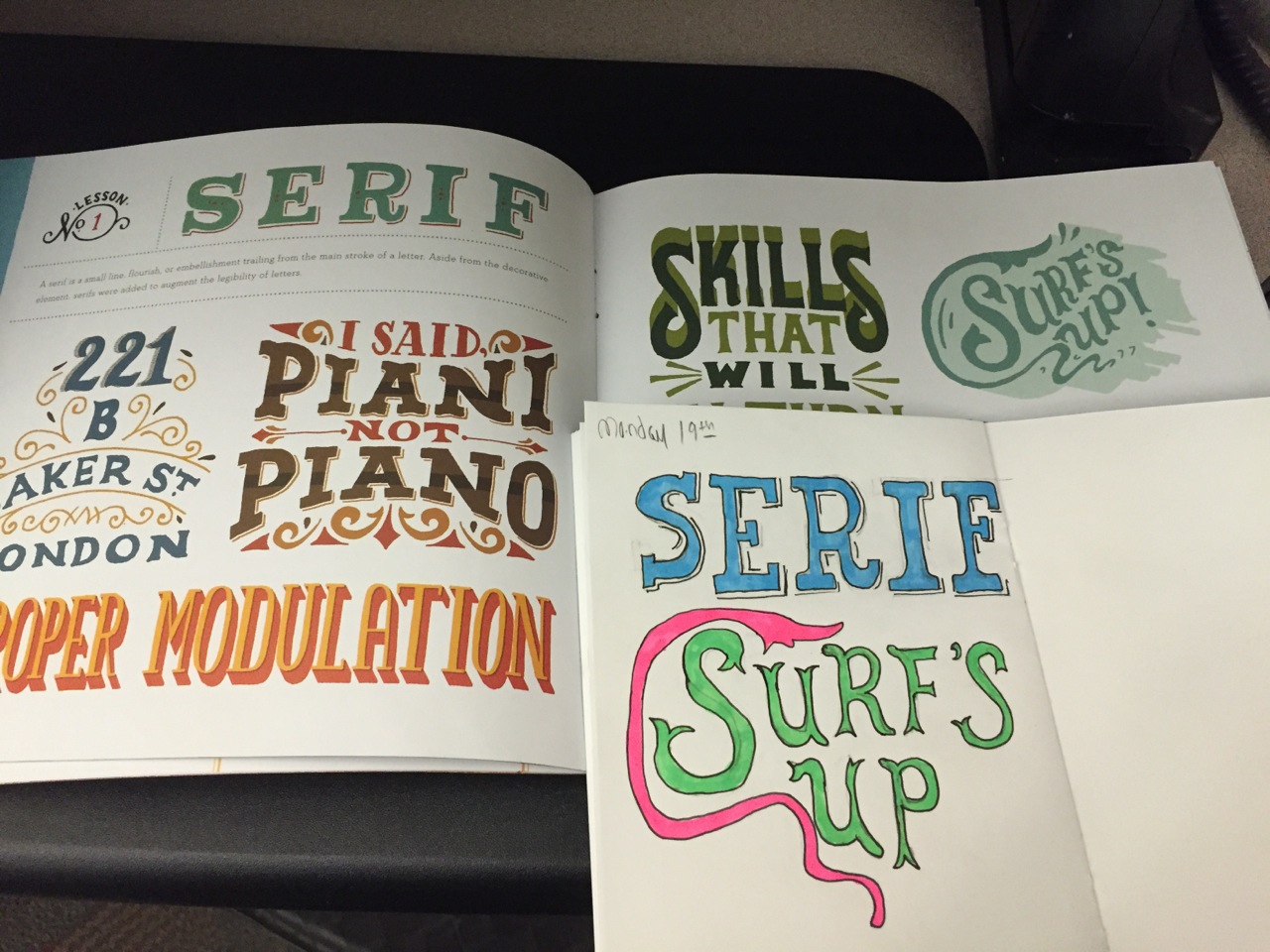
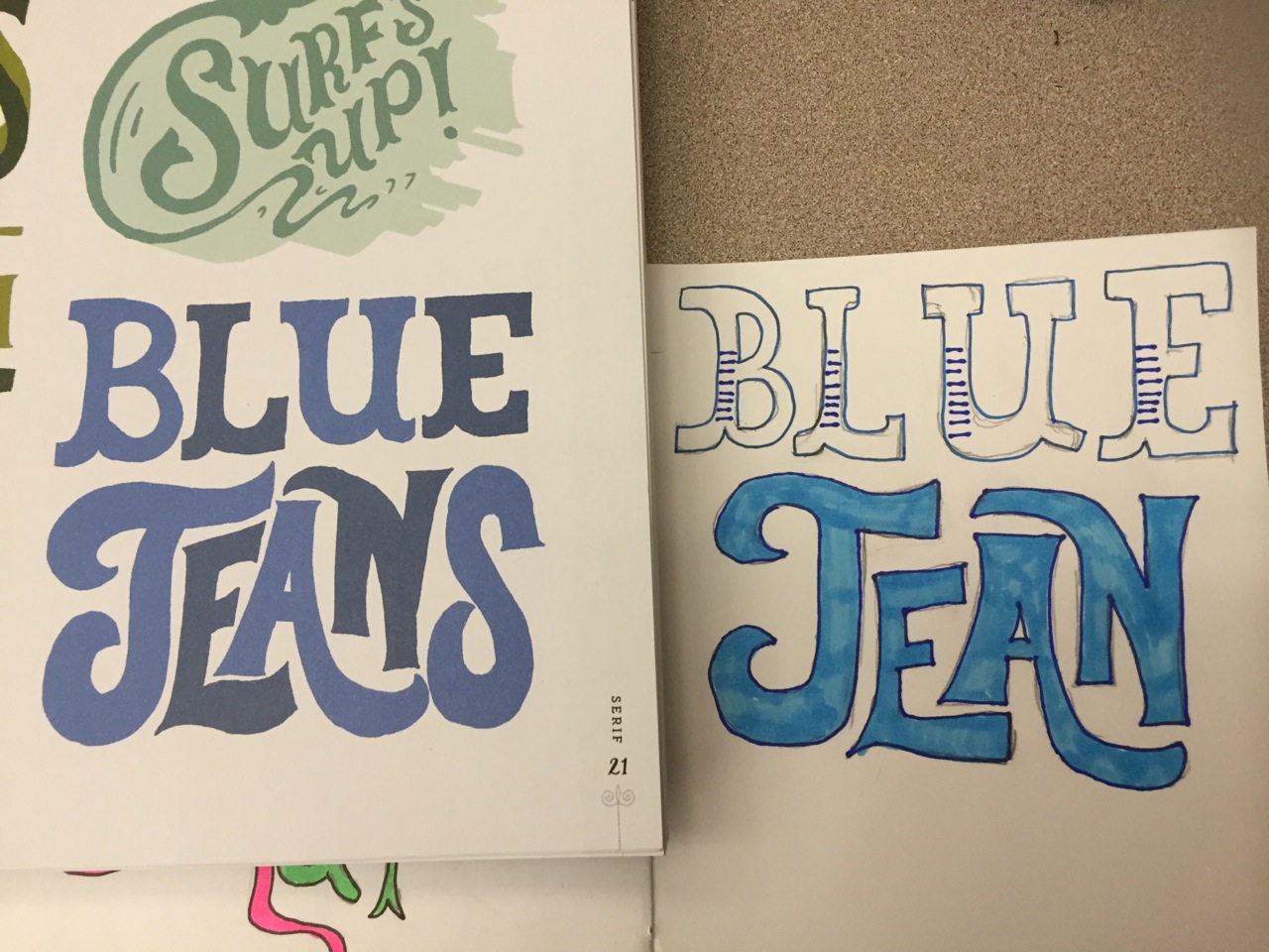
Trying out the “Serif” title and my spin on the “Surf’s Up” drawing. On the latter, I was just trying to copy the letterform shapes and not mess with trying to get the perspective right like she had it.

Right now, I started simply with copying some of the executions on the Lesson 1: Serifs pages. This isn’t the actual lesson for that section, just creative ways she does serif lettering. I am freehanding them, so they’re definitely rough around the edges and my notebook is small so squeezing things in at the right scale is a bit of a challenge. Hence, why “blue jeans” lost the “S” in my rendition. But it’s giving me good practice to see how the letterforms are created and fit together. I have some tracing paper that I’m going to use as well so that I can really get a feel for the more exact formations of the letters.

Whether I get good enough at lettering to ever market it as a skill or not, I thoroughly enjoy it and find it to be a great, creative exercise away from the screen.

Stay tuned as the adventure continues…

Blue Jeans became Blue Jean as my notebook is quite tiny, and I'm not good at gauging the spacial relations of the letters yet.

Blue Jeans became Blue Jean as my notebook is quite tiny, and I’m not good at gauging the spacial relations of the letters yet.