
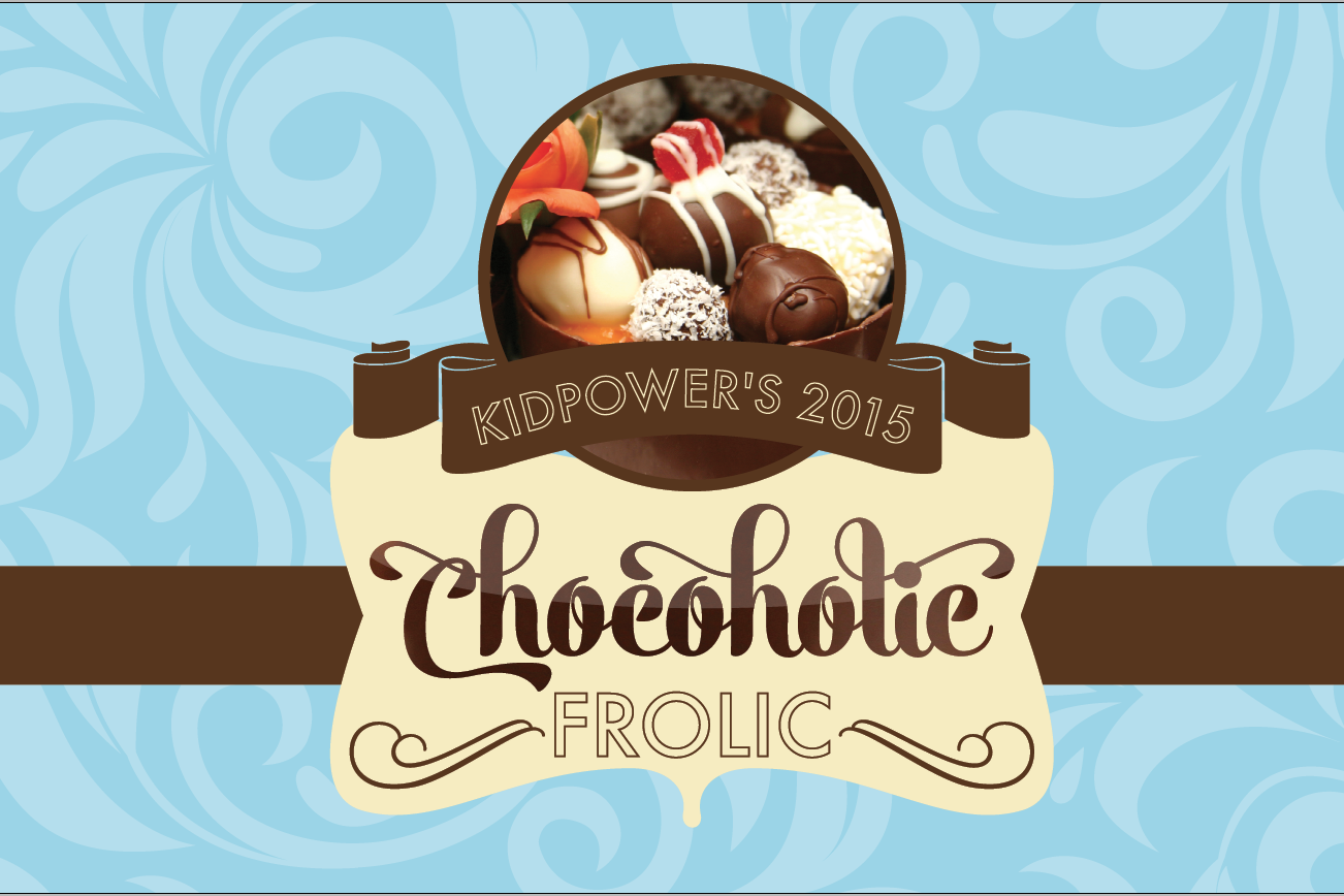
The design concept for the Chocoholic Frolic, a fundraising event for a nonprofit here in Colorado Springs.
For the last several months, I’ve been working on a freelance project for a nonprofit here in town. I think it’s good to share work and the creative process, especially when you’re a small business like me. The big designers with big clients get all the glory, but the truth is, we small freelancers produce some good design as well and usually on very small budgets. Realistically, that’s what most of us end up working with—small clients with small budgets. But, it shows how good a designer can be when they have to make their designs shine instead of relying on stellar custom photography and high end print techniques.
The nonprofit I did work for, Kidpower, helps provide resources for abused children and provide workshops in schools on how kids can stay safe and be empowered. Once a year, they have a fundraiser called the Chocoholic Frolic that is quite a fancy gala. Local chocolatiers come and have tables of fancy desserts and sculptures, there’s a jazz band and it’s cocktail attire.
In previous years, the organization couldn’t afford a designer and did their best in-house. This year, they found my website online and hired me to take their invitation and event branding to the next level. The save the date card had already gone out, so it was vital I still use the stock photo of the chocolate desserts they’d already purchased. Furthermore, the client wanted me to maintain some design elements from previous years in order to not have it unrecognizable to their attendees.
Finally, I had to make a series of posters that were separated from the event branding that emphasized this year’s theme, “WIsh Upon a Star: Every child, everywhere is confident and safe.” The posters will be displayed at the event and make attendees aware of the organization.
Initially I’d thought about making their invitations look like a chocolate bar wrapper, but after a discussion with the client, I realized that wasn’t the correct route to go. The event is far too elegant and formal to use something simple like a chocolate bar wrapper. I did some online research, looking at the websites for the top chocolatiers around the world. They carried similar themes of elaborate script fonts, ribbons and sticker seals to hold their boxes of treats together.
I decided to go this direction. I kept a damask background, similar to what they’d used in previous years to tie in the familiarity with the design. I used a fancy script font for the word Chocoholic and gave it a sheen so it would look like liquid chocolate. I added a thick chocolate ribbon with a vanilla sticker seal to mimic the way chocolatiers shut their boxes. I chose a rich ice blue to contrast with the deep chocolate tones that would give it elegance and stand out. Finally, I brought in a modern sans-serif font as a way to freshen up the very traditional feel of the rest of the design.
The client was ecstatic with my design. They were thrilled with my concept and that I had listened to their needs. Overall, the entire brand package turned out beautifully and both myself and the client are beyond pleased with the final results. They’ve been great to work with, and it’s been a really fun experience. I get to attend the event in May, and I’m excited to see my work in the setting.

The invitation package consisted of the main invite, a RSVP card and a thank you note to those who attended. I had to work with a lot of copy and limited space plus list a lot of sponsors, but I was able to maintain an elegant design.

The invitation package consisted of the main invite, a RSVP card and a thank you note to those who attended. I had to work with a lot of copy and limited space plus list a lot of sponsors, but I was able to maintain an elegant design.

The invitation package consisted of the main invite, a RSVP card and a thank you note to those who attended. I had to work with a lot of copy and limited space plus list a lot of sponsors, but I was able to maintain an elegant design.

Attendees will be greeted at the venue by this poster.

This is one of the on-site posters that will be at the event advertising the jazz lounge.

I had to design 4 posters to be displayed at the event. The posters weren’t supposed to have the event branding, but rather, were supposed to stay within this year’s theme. They wanted to use facts about their organization and large photos of the kids they help. Wish Upon a Star is the theme and I used large stars to frame out the photos of the kids. I did blankets of stars to help separate the header content and the organization’s logo on the bottom and provide a frame for the facts. Their decorations at the event will be navy and silver, so I used those 2 colors plus added some gold/yellow to help the key points stand out.

I had to design 4 posters to be displayed at the event. The posters weren’t supposed to have the event branding, but rather, were supposed to stay within this year’s theme. They wanted to use facts about their organization and large photos of the kids they help. Wish Upon a Star is the theme and I used large stars to frame out the photos of the kids. I did blankets of stars to help separate the header content and the organization’s logo on the bottom and provide a frame for the facts. Their decorations at the event will be navy and silver, so I used those 2 colors plus added some gold/yellow to help the key points stand out.

I had to design 4 posters to be displayed at the event. The posters weren’t supposed to have the event branding, but rather, were supposed to stay within this year’s theme. They wanted to use facts about their organization and large photos of the kids they help. Wish Upon a Star is the theme and I used large stars to frame out the photos of the kids. I did blankets of stars to help separate the header content and the organization’s logo on the bottom and provide a frame for the facts. Their decorations at the event will be navy and silver, so I used those 2 colors plus added some gold/yellow to help the key points stand out.

I had to design 4 posters to be displayed at the event. The posters weren’t supposed to have the event branding, but rather, were supposed to stay within this year’s theme. They wanted to use facts about their organization and large photos of the kids they help. Wish Upon a Star is the theme and I used large stars to frame out the photos of the kids. I did blankets of stars to help separate the header content and the organization’s logo on the bottom and provide a frame for the facts. Their decorations at the event will be navy and silver, so I used those 2 colors plus added some gold/yellow to help the key points stand out.
